FIT UI Design - Certificate Course
Project: Seated App Redesign
Role: UI/UX, Branding, Mobile App Prototype, “Rewards” User-Flow.
Duration: Nov. 2019 - Dec. 2019
Team: Kal Grinberg, Christine Chung, Byron Escobar, DK Lee, Jonathan Shao, Kyle Picone

Project: Seated App Redesign
Role: UI/UX, Branding, Mobile App Prototype, “Rewards” User-Flow.
Duration: Nov. 2019 - Dec. 2019
Team: Kal Grinberg, Christine Chung, Byron Escobar, DK Lee, Jonathan Shao, Kyle Picone


While working with my team to improve the UI of the Seated app, I took responsibility for rethinking the user-flow of the “rewards” sequence. This moment is defined by the actions required on the user’s side to ensure they receive the rewards from their finished dining experience. The original design lacked a sense of Seated branding. There was also a major pain point in the way receipts were photographed and submitted. The original app requires users to take a photo and submit it for review. These photographs are being reviewed by a support team manually. The user normally gets a text message 30 minutes later stating that their rewards have been received.
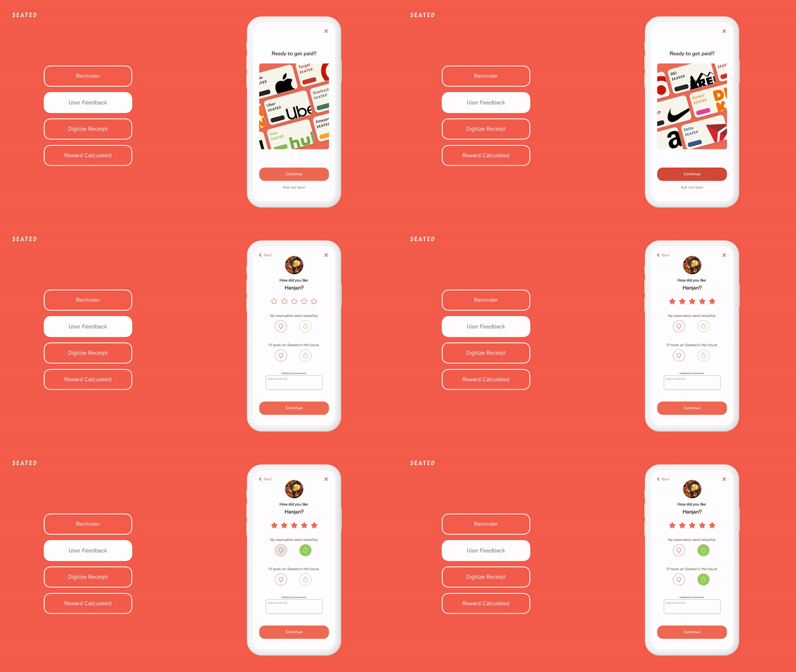
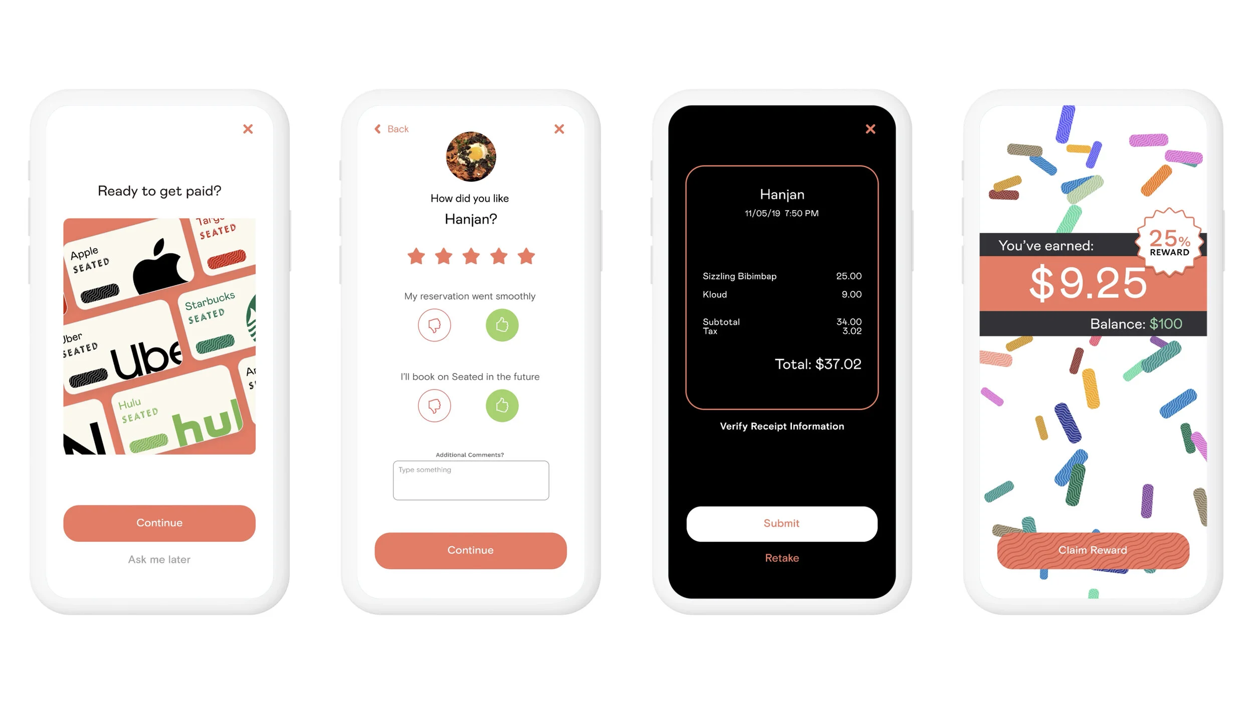
The way I went about solving these issues begins with the visual presentation of the rewards flow. By working with my team to establish a design system and style-guide, we were able to create a user experience that feels more aligned with the brand. A push-notification reminds the user to keep and submit the receipt after their dining experience is over. After tapping the notification, the user is greeted by an exciting animation that reminds them of the different brands they can spend their earnings on. In order to speed up the rewards calculation process, I took inspiration from AI text recognition software, and mocked up a flow that drastically reduces waiting time for the user. Now, the user aligns their phone with the receipt and watches the text become digitized. Once they confirm, the rewards are calculated in real-time, right before the user’s eyes. They get to see exactly how much they earned, without any delay.


